Final! After the last in progress critique, I started thinking about my "why" a lot. I decided that I wanted to represent the efforts I have been making to really find myself these past few months after really losing sight of myself through a toxic relationship as well as the toxic friendships I had had in my life for so long. I tried to depict this through an abstract portrait where you can't really tell what you're looking at and you have to really look and find me in there. I then decided to use the repetition technique because I really like the way it looks and it can also contribute to the idea of the different versions of myself I have gone through while doing my soul searching. I wanted to have the effect of me almost shaking my past off as I move toward the future so I used the splatter brush tool a lot. I blended my background layers together then added the picture of myself. I always try to start with a background with so...

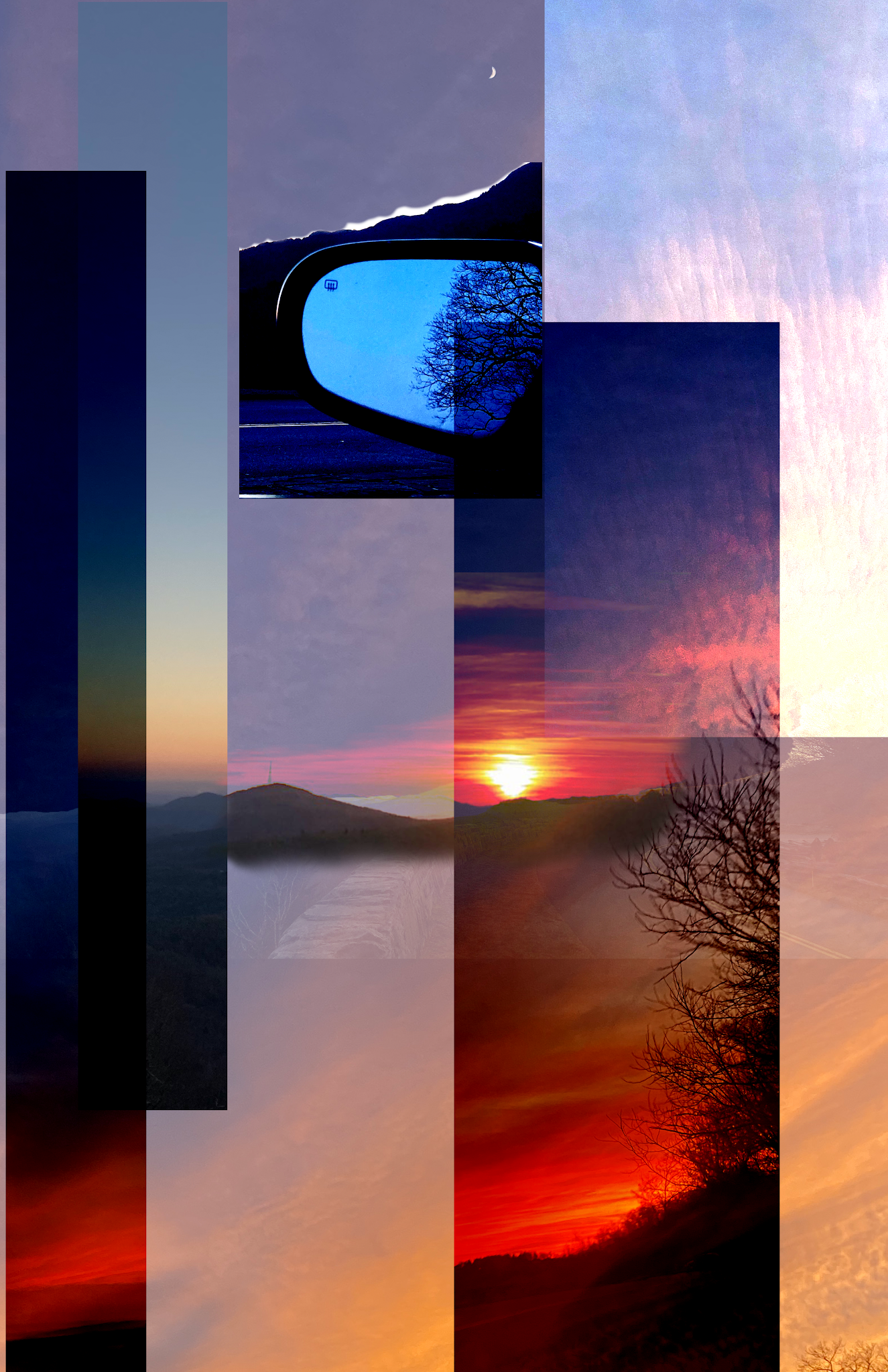
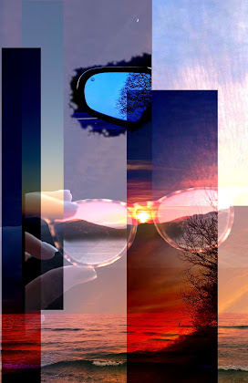

I love these! I'm especially intrigued by the contrast between the sharp edges of the rectangle photos and the uneven edge of the car mirror image in the second iteration. I look forward to hearing more about your concept and seeing how you explore your ideas further!
ReplyDeleteI really like the sharp, bright and vibrant colors! The contrast is beautiful and all of the elements work really well together. I'm not quite sure what the message is, but you're off to a great start!
ReplyDeleteThe color interactions that are happening with the color blocking make these very interesting to look at. Right now my eyes is moving up and down across the images, and I wonder what it might look like to include some horizontal lines, or other visual elements to encourage more movement of the eye when looking at it.
ReplyDelete-Elena
I agree with Elena, I wonder how your image would look if you incorporated some horizontal images or lines. Maybe you could even use images that have a horizontal composition, or have an object that is horizontal? I think the idea of this is interesting and the colors and rectangles keep the eye moving across the images. I would try to add some unexpected things to it as you keep making new iterations!
ReplyDeleteMaddie! Love, love, love these. Both iterations are so aesthetically pleasing to look at. Elena's comment intrigued me too-- I'd love to see horizontal image strips, but I think it would be fun to see a horizontal version before combining vertical and horizontal forms (basically process pics), if that makes sense... I'm imagining another separate iteration with an almost checkered pattern of horizontal and vertical lines. Just a few thoughts that were coming up for me; I think you've done a really nice job! I'm excited to see where this takes you!
ReplyDelete- Julia